The December 1999 issue of Wired had the first public showing of our map. I have put up the postscript of a version similar to the one we gave them.
In the fall of 2000, Ches and Hal moved to a spin-off from Lucent/Bell Labs named Lumeta Corporation. This company applied our topological discovery techniques to discover the perimeter of our clients' intranets. We both have moved on from Lumeta.
These paths change over time, as routes reconfigure and the Internet grows. We are preserving this data, and plan to run the scans for a long time. The database should help show how the Internet grows. We think we can even make a movie of this growth someday.
The simple layout algorithm produces some nice maps.
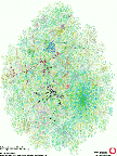
We have made some maps from this layout. A map helps us visualize things, to pick out points of interest, and find things that warrant closer inspection. Once the layout is computed, the map can be colored to show a number of things. The Internet is its own space.
The layout can be colored in many ways: with geographical clues, network capacity, etc. An Internet atlas would be interesting. We currently have maps colored by distance from the test host, IP address, and geographic region.
These maps are quite smashing, if we do say so ourselves. The December 1998 issue of Wired Magazine has the layout generated from data collected in mid-September. Hal generated a color scheme based on the IP address of the nodes. This sick idea ("Excuse me, may I have a prettier Internet address please?") creates a color scheme that seems to match Wired's traditional typography. But it actually does show communities that share similar network addresses.
As of February 2020, four images I sent to Scientific American in February
2000 are now available, in postscript form:
sciam1.ps,
sciam2.ps,
sciam3.ps,
and
sciam4.ps.
Where are you on the Wired map? Don't ask. With nearly 100,000
nodes on the map, an index would be a huge sea of small type.
The database is documented
here.
There has been confusion about this database. It is not the picture
itself, but the raw data of the traceroute paths. It is a compressed
text file, not a Microsoft Excel, or other database file.
The packets are sent with slowly-incrementing TTL fields. When a packet
fails to return, perhaps because it was lost or dropped by a firewall, we
try a couple more times, then give up, recording any return code.
We now run the layout on the minimum distance spanning tree, and the
results on a 36 inch plotter are very close to a nice map.
Here's a movie (13MB) of one recent layout.
This data cries for interactive visualization tools. We've tried 3D,
which didn't help as much as you might think. Lumeta now has the
Mapviewer product which allows our clients to dig down into these
graphs and extract a great deal of data about routers and connectivity.
One goal is to collect the data over time, and make a time-lapse movie
of the growth of the Internet. Time-lapses of the annealing process
are already interesting: it writhes and squirms and such.
Uses
This data has a number of uses, including collaborations
with other Internet mapping projects (see below.)
Mapping Details, or "What are you doing to my net?"
The net mapping program sends small UDP packets to random high-numbered
ports, or ICMP ping packets, while varying the packet's time-to-live (TTL) field.
The TTL is
decremented on each hop out. When it hits zero, the death of the packet
is reported back to the sender. We do not expect to reach a working host,
much less an active UDP service.
Future Work
The early results looked like a peacock smashed into
a windshield. Though you could pick out the
major ISPs and some interesting details around the edges, the map was't very
useful.
Links to other Internet mapping efforts